
How to Review a Product Photography Portfolio (What the Pros Look For)
You're ready to hire a product photography studio, so you start browsing portfolios. And honestly? They all start looking the same after a while. Beautiful images of products. Nice lighting. Clean backgrounds. How do you actually tell which studios know what they're doing versus which ones just got lucky with a few good shots?
After seven years running a Brooklyn photography studio and reviewing countless photographers' work, we know exactly what separates strong portfolios from mediocre ones. Let's break down what to look for—and what red flags to watch for—when evaluating product photography portfolios.
The First Rule: They Should Show Products Like Yours
This sounds obvious, but you'd be surprised how many brands ignore it.
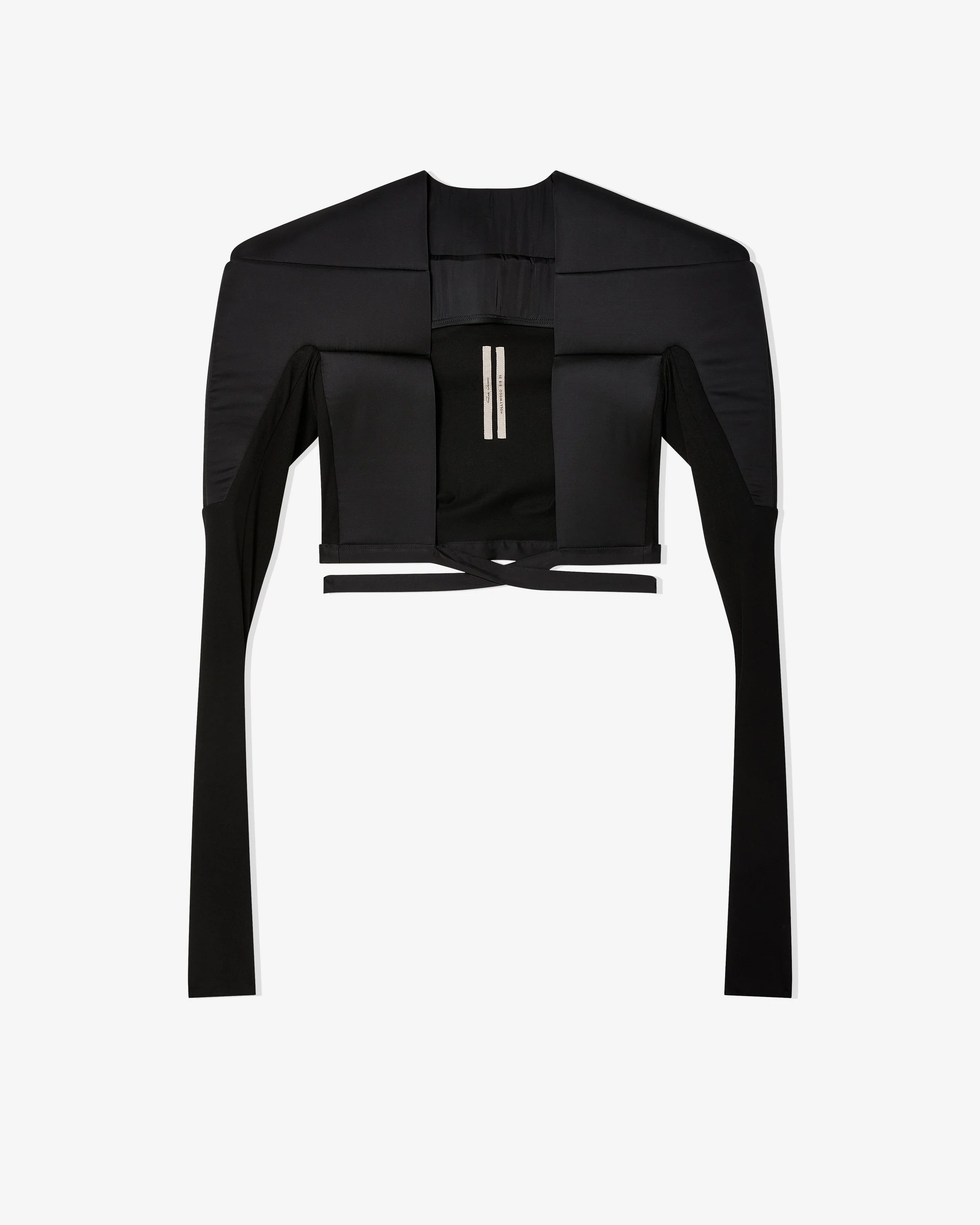
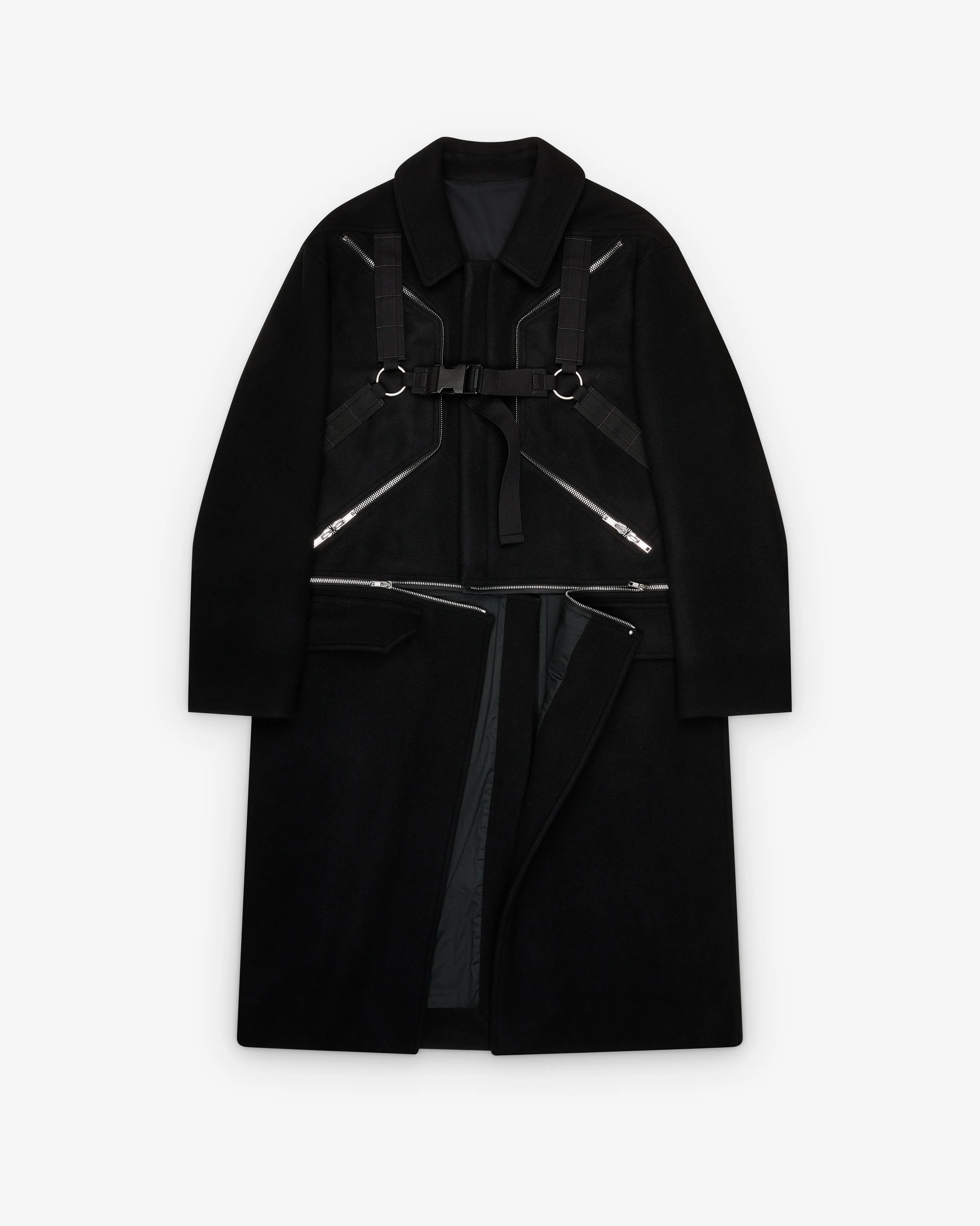
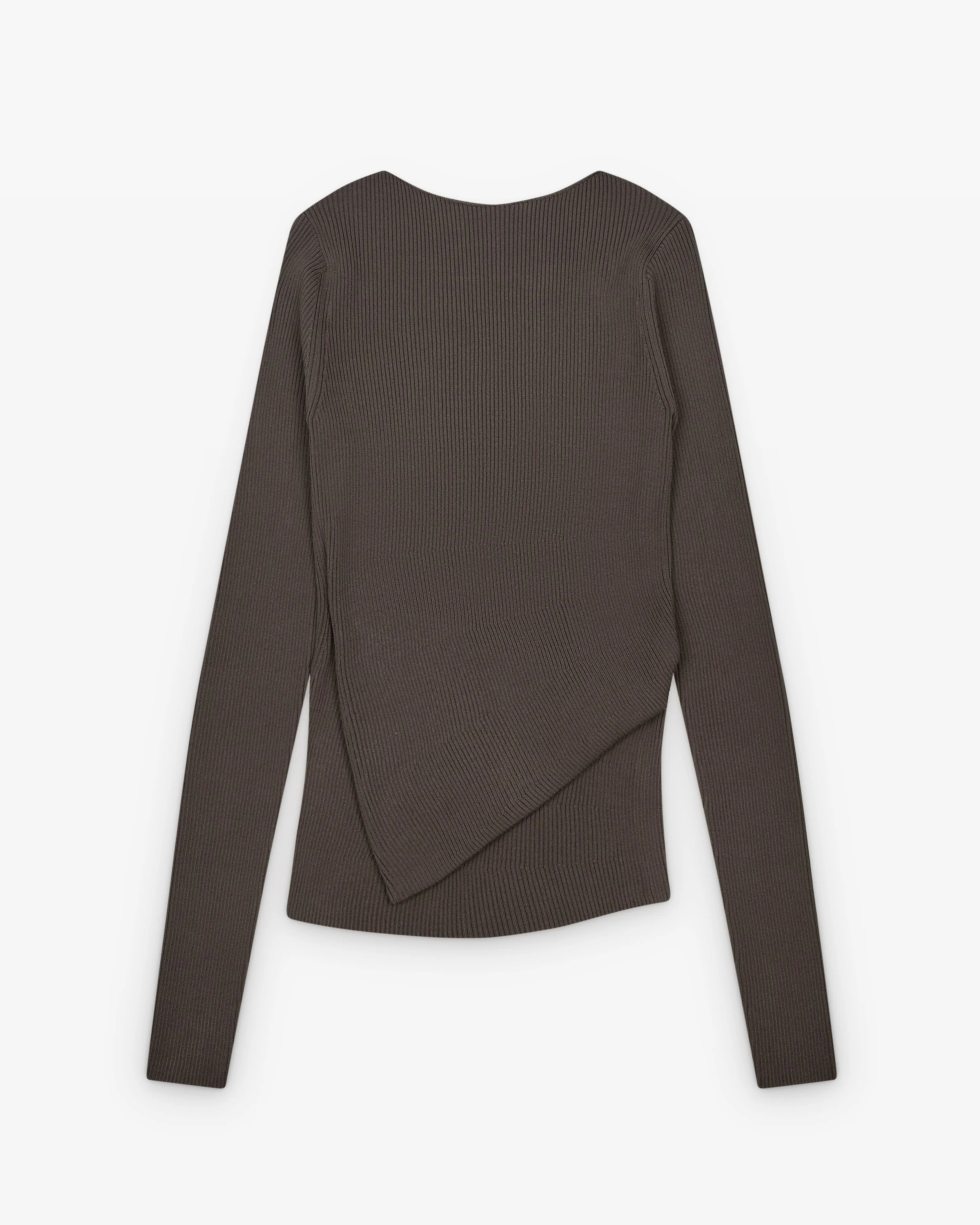
A photographer with a stunning portfolio of jewelry might be terrible at apparel. Someone who excels at food photography might struggle with cosmetics. Product photography specializations matter.
What to look for:
- Portfolios that feature your product category specifically
- Multiple examples within your category (not just one lucky shot)
- Recent work (within the last 1-2 years)
Red flags:
- Generic "product photography" portfolio with no category focus
- Only 1-2 examples of products like yours buried in a massive portfolio
- Old work (5+ years) with nothing recent
- Stock photos mixed with their own work (yes, this happens)
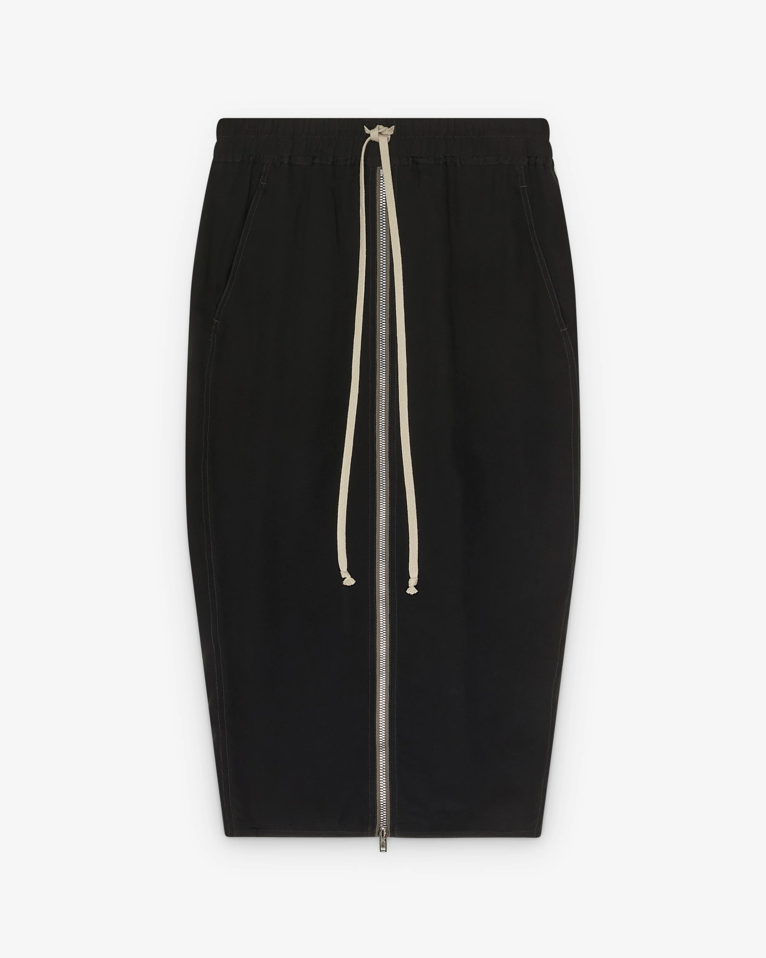
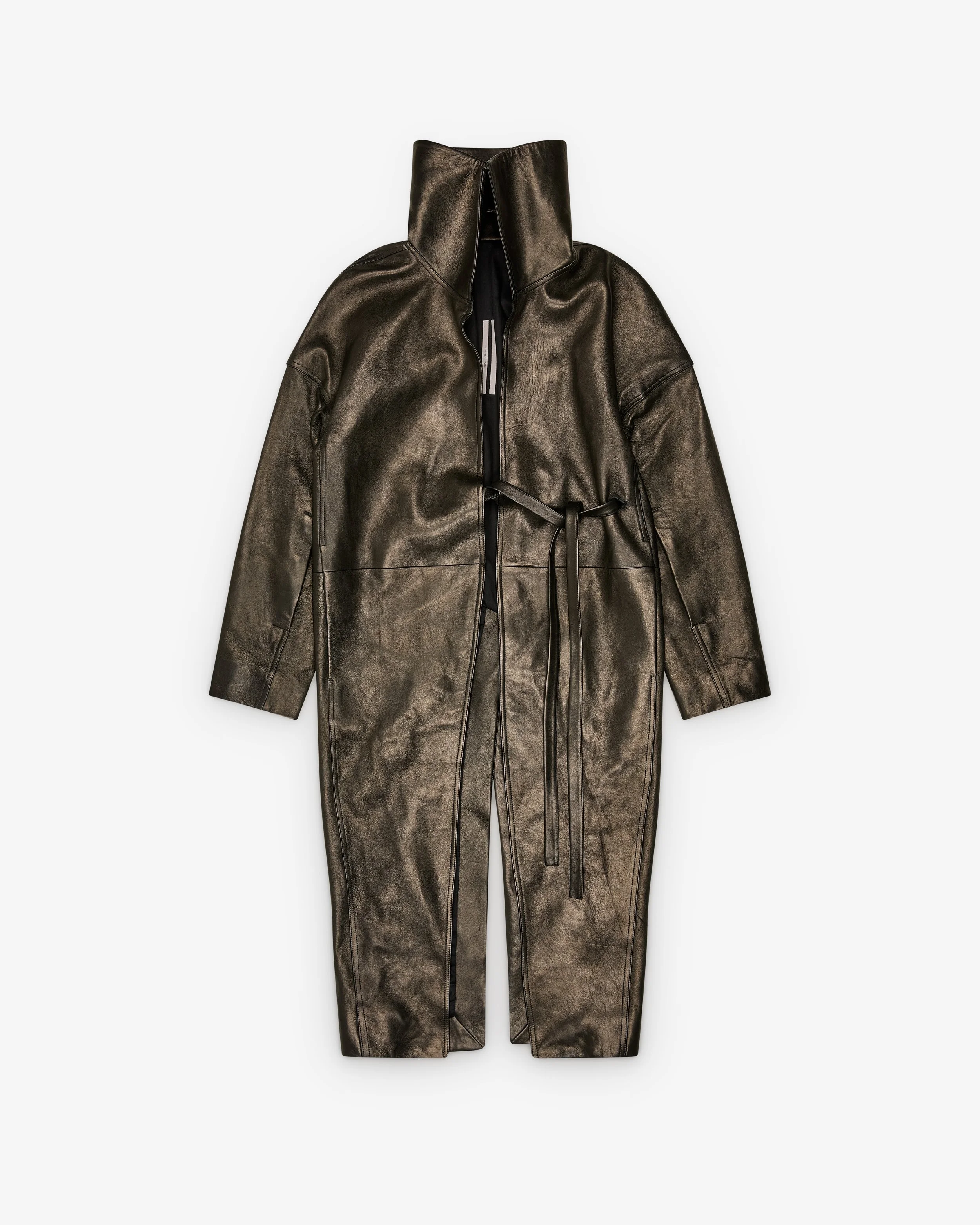
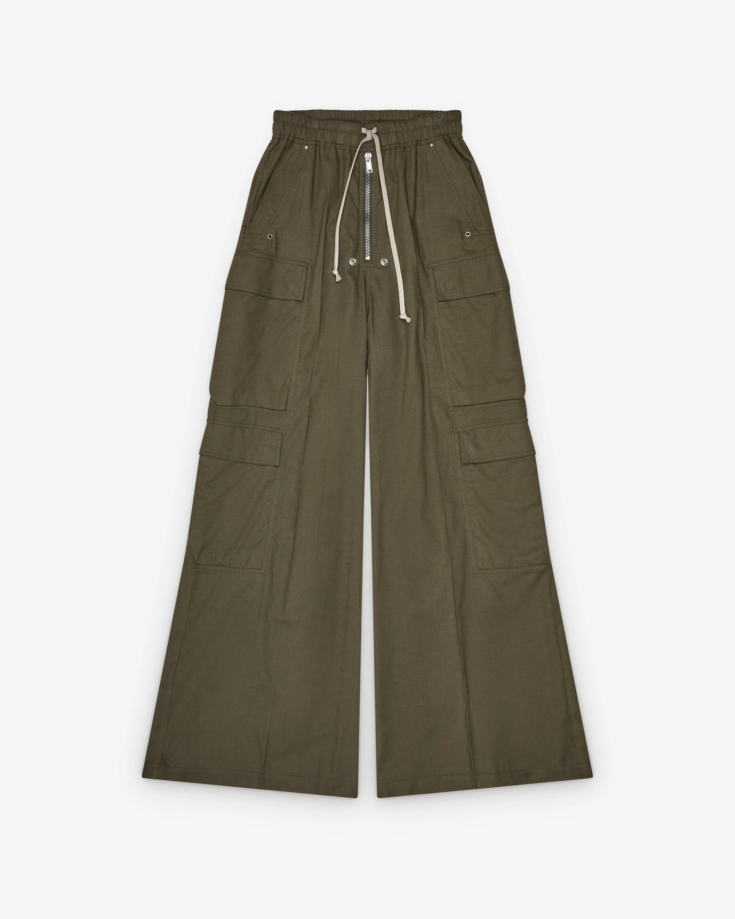
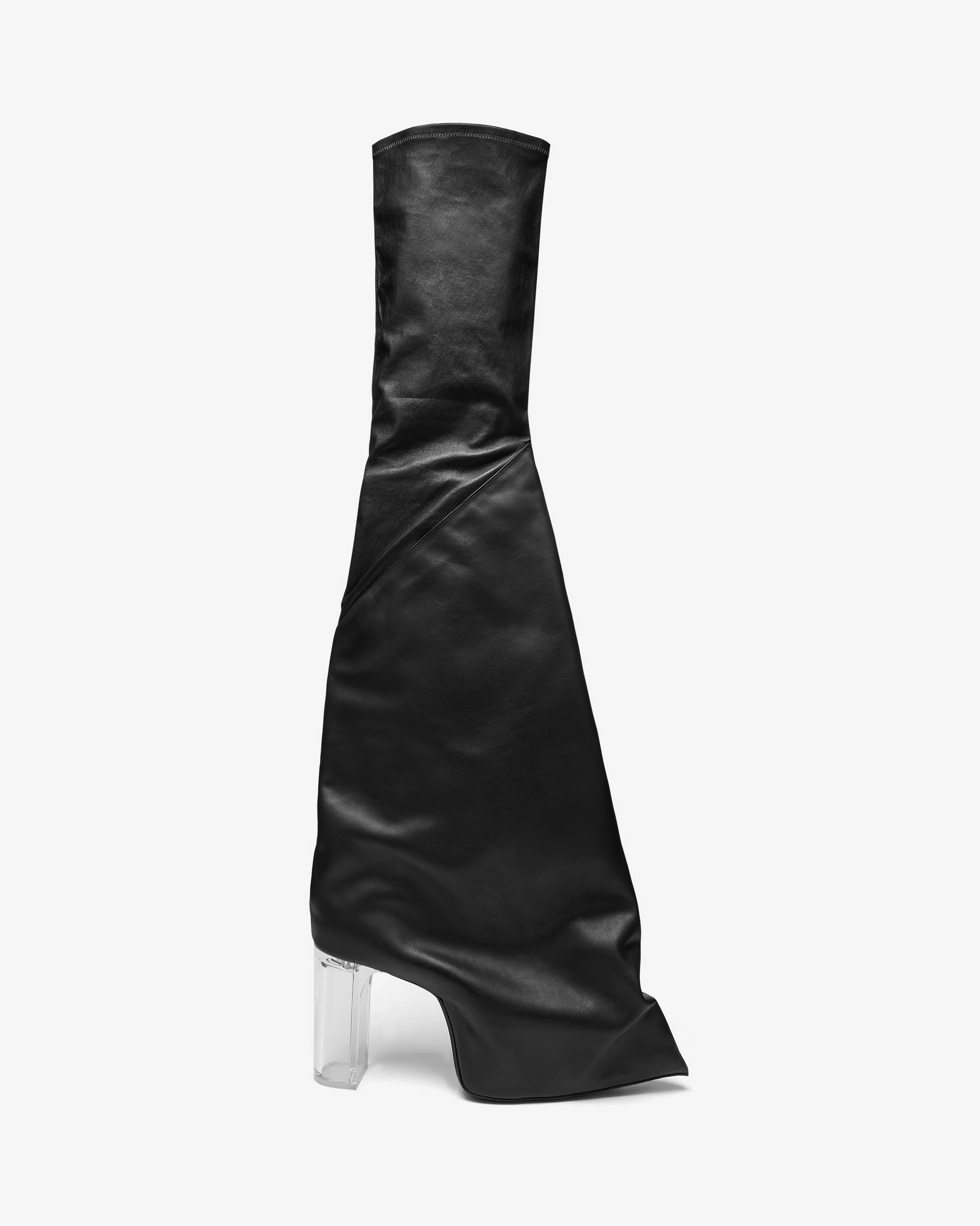
When reviewing our case studies, brands should see comprehensive examples of apparel, accessories, and beauty products—not just cherry-picked hero shots.
Lighting Consistency: The Make-or-Break Factor
Professional studios maintain consistent lighting across entire product catalogs. Amateurs don't.
Browse through multiple images in their portfolio and ask: "Does the lighting feel consistent from image to image?" Professional work has:
Even, controlled lighting:
No harsh shadows in one shot and blown-out brightness in the next. The quality of light should feel deliberate and repeatable.
Proper white balance:
White backgrounds should actually look white, not blue-tinted or yellow-tinted. If the "white" background shifts colors between images, that's a sign of poor color management.
No visible reflections or glare:
Look at glossy products like jewelry, cosmetics bottles, or leather goods. Can you see the photographer reflected in the product? Are there random light reflections that distract from the product itself? Professionals use techniques to control or eliminate unwanted reflections.
Appropriate shadows:
Some products benefit from subtle shadows that add dimension. Others need completely flat lighting. Professional portfolios show understanding of when to use each approach.
Red flags:
- Inconsistent lighting between similar products
- Visible glare or reflections in glossy items
- Muddy shadows that obscure details
- Harsh lighting that creates unflattering contrast
Detail and Sharpness: Can You See the Quality?
Professional product photography should be tack-sharp with visible detail—especially in areas that matter to customers. Here’s what to look for.
Zoom into the images (if the portfolio allows). Can you see:
- Fabric texture on apparel (individual threads, weave patterns)
- Stitching details and construction quality
- Metallic finishes and hardware details
- Product labels and text (should be crisp and readable)
- Skin pores on beauty model shots (yes, this level of detail matters)
If images look soft, blurry, or lack fine detail, either they:
- Don't have professional equipment
- Don't know how to use their equipment properly
- Are showing you web-only JPEGs that hide quality issues
Professional studios deliver images where you can zoom in and examine product quality—because that's what converts browsers into buyers.
Red flags:
- Soft focus or blurriness
- Images that look good at thumbnail size but fall apart when viewed larger
- Lack of detail shots in portfolio (if they don't show closeups, can they actually capture them?)
- Heavy-handed filtering that obscures detail
Consistency Across a Full Collection: The Volume Test
Anyone can nail one perfect product shot. Professionals maintain quality across 50, 100, or 500 products.
How to evaluate consistency:
Look for portfolio examples showing complete collections or multiple products from the same client. Does the quality remain consistent from product #1 to product #30?
Check specifically:
- Lighting consistency: Same quality of light across all pieces
- Background consistency: No color shifts or textures changes
- Styling consistency: Products arranged with similar care and attention
- Editing consistency: Similar retouching standards throughout
This is where high-volume product photography expertise becomes visible. When we photograph 300+ pieces for Dover Street Market, the lighting and quality on product #300 matches product #1.
Red flags:
- Portfolio shows only individual product shots, never full collections
- Visible quality decline within the same project
- No examples of large-scale projects
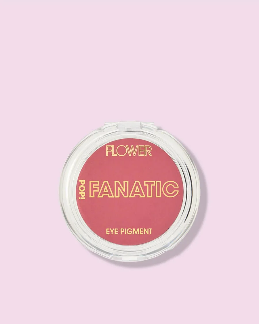
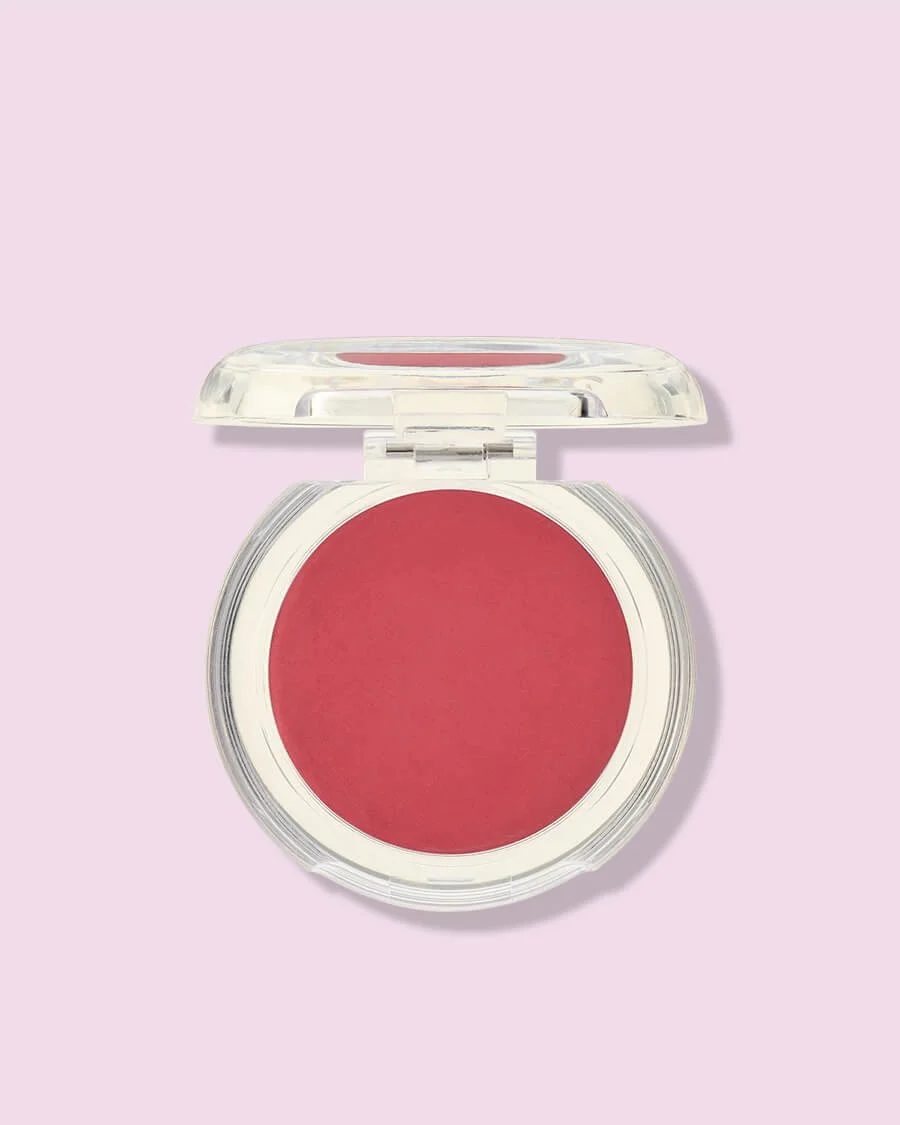
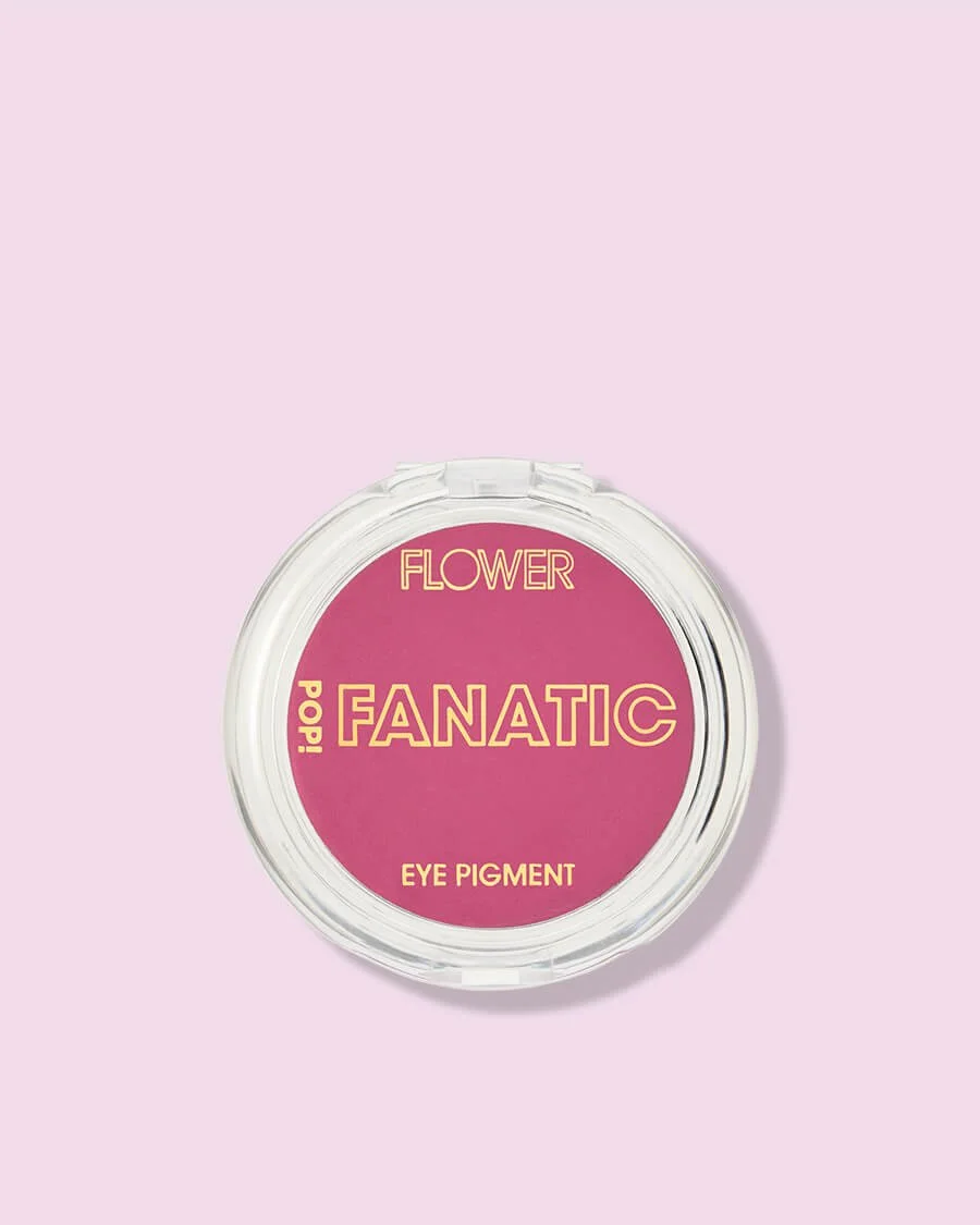
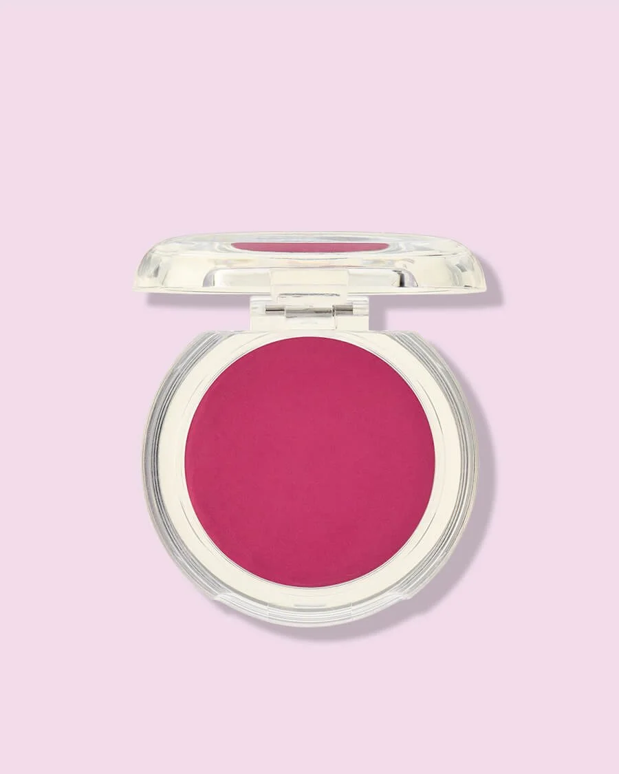
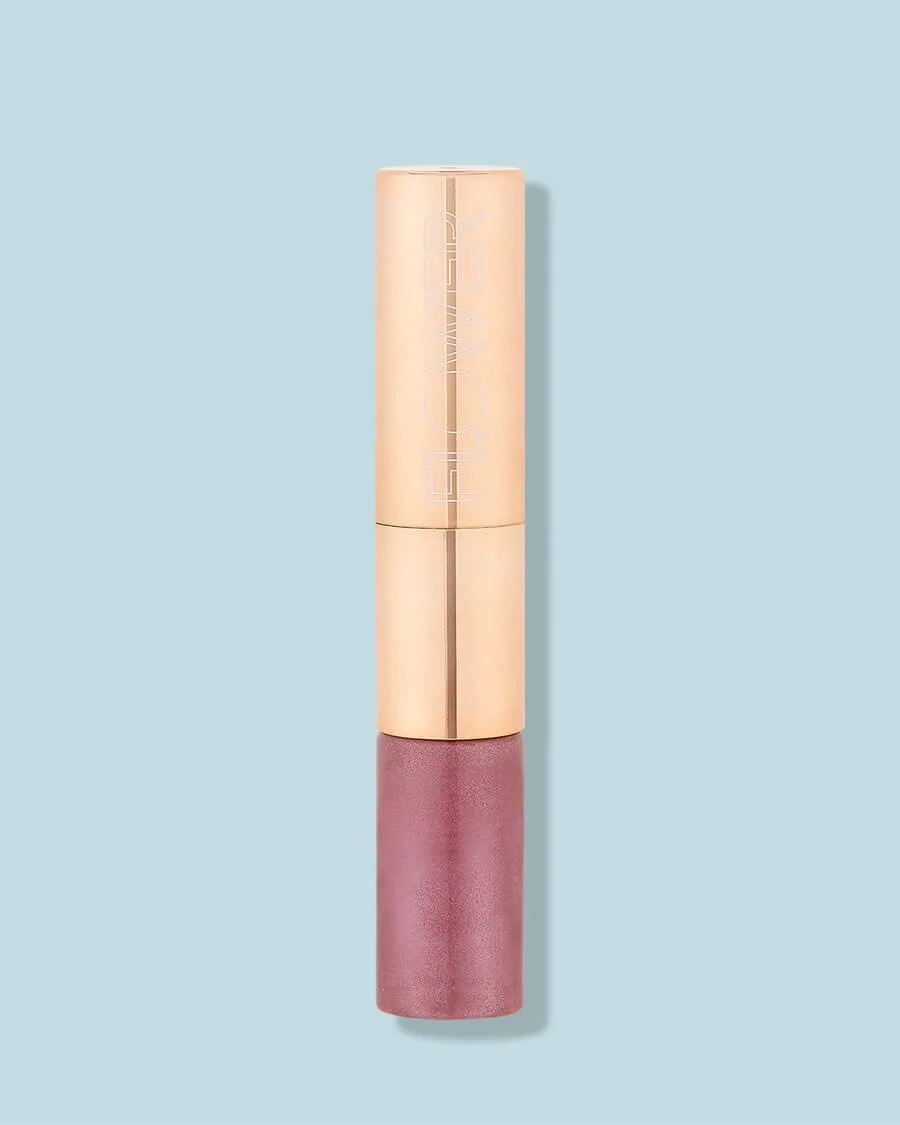
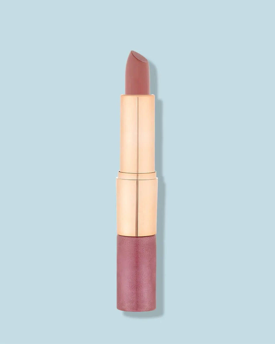
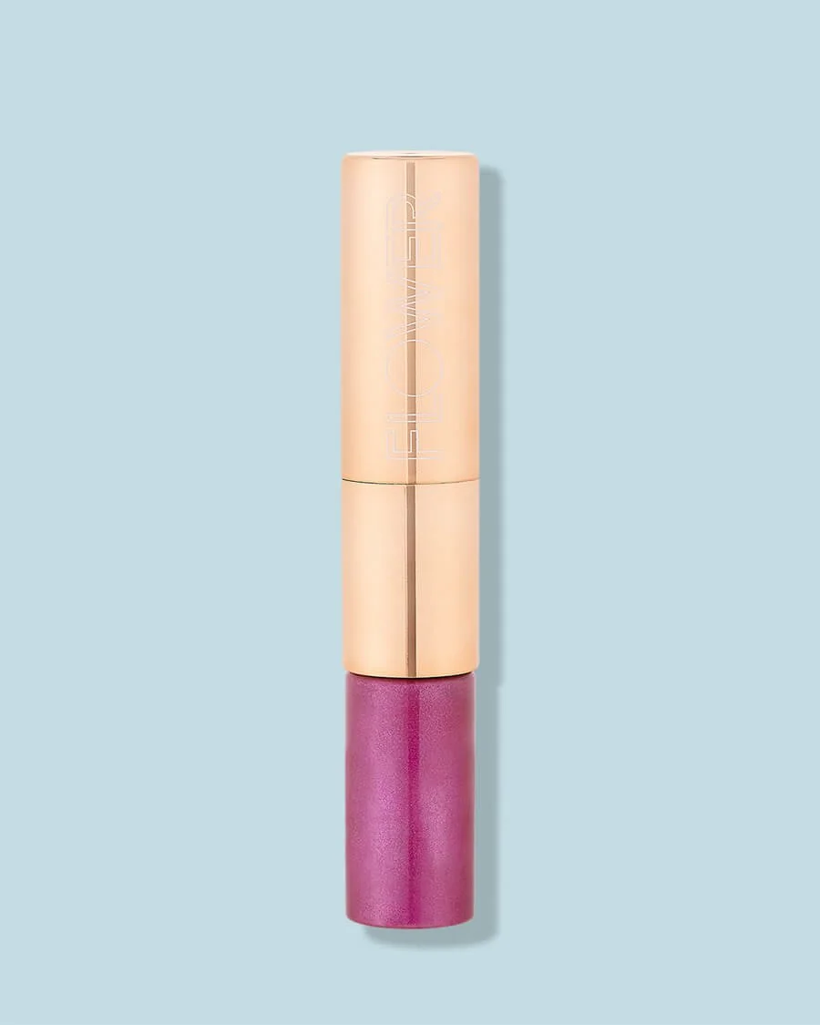
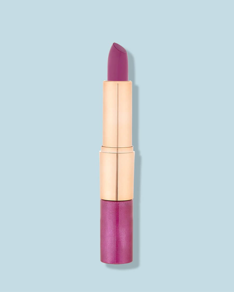
Color Accuracy: The Beauty Brand Test
For beauty and cosmetics brands, color accuracy is non-negotiable. But how do you evaluate it from a portfolio?
Multiple shades photographed together:
If a portfolio shows 10 lipstick shades side by side, look at the color relationships. Do they look like distinct colors or do they all blur together? Can you see the difference between warm red and cool red?
Skin tone representation:
If they show makeup on models, do the skin tones look natural? Over-editing often makes skin look plastic and destroys color relationships.
Product color consistency:
If you see the same product photographed in different contexts (closeup, with other products, lifestyle shot), does the color remain consistent?
White backgrounds that are actually white:
A truly white background is harder to achieve than it looks. If their "white" backgrounds look cream or gray, they're not color-managing properly.
For beauty photography, we invest in calibrated monitors, controlled lighting, and color management workflows specifically to nail color accuracy. If a studio's portfolio doesn't demonstrate this capability, assume they don't have it.
Red flags:
- Only single-shade product shots (avoiding the multi-shade accuracy test)
- Over-saturated, unrealistic colors
- Skin tones that look unnaturally smooth or discolored
- White backgrounds with color casts
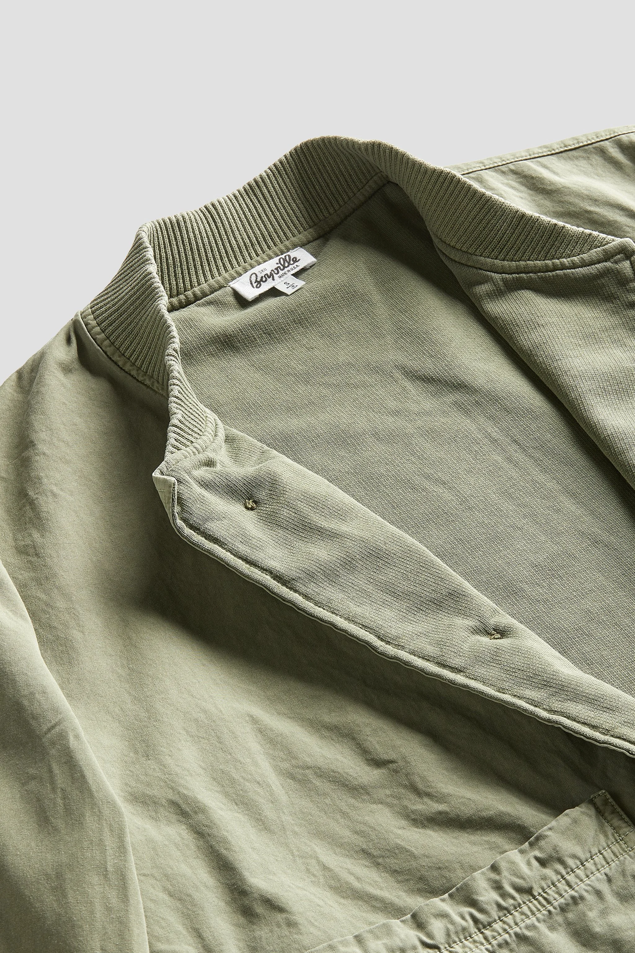
Styling and Product Preparation: The Professionalism Indicator
Look beyond the photography itself—how are products prepared and styled?
Apparel:
- No wrinkles or creases (everything perfectly steamed)
- Symmetrical arrangement (sleeves positioned identically)
- Collars, cuffs, and hems positioned deliberately
- Clothing looks full and dimensional (not flat and limp)
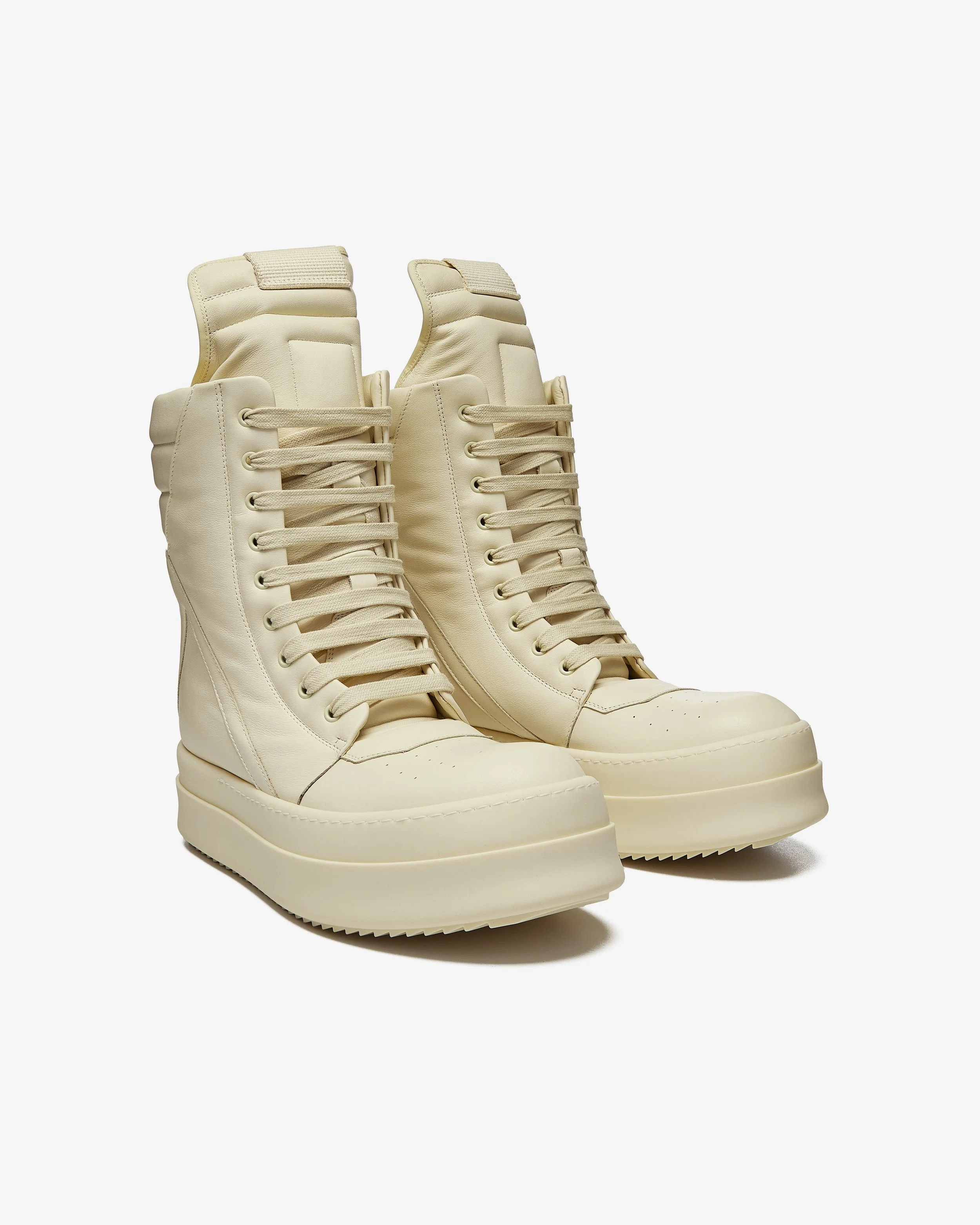
Accessories:
- Handbags properly stuffed to show shape
- Jewelry positioned to show detail and sparkle
- Shoes cleaned and laces arranged
- No dust, fingerprints, or smudges
Beauty Products:
- Bottles clean and fingerprint-free
- Labels aligned consistently
- Caps and pumps positioned identically
- No air bubbles or separation in products visible through clear containers
These details seem minor, but they're what separates professional work from amateur. Look through our accessories portfolio—every handbag is stuffed to show structure, every piece of jewelry is polished, every product is camera-ready.
Red flags:
- Visible wrinkles on clothing
- Smudges, dust, or fingerprints on products
- Crooked labels or misaligned elements
- Products that look carelessly arranged
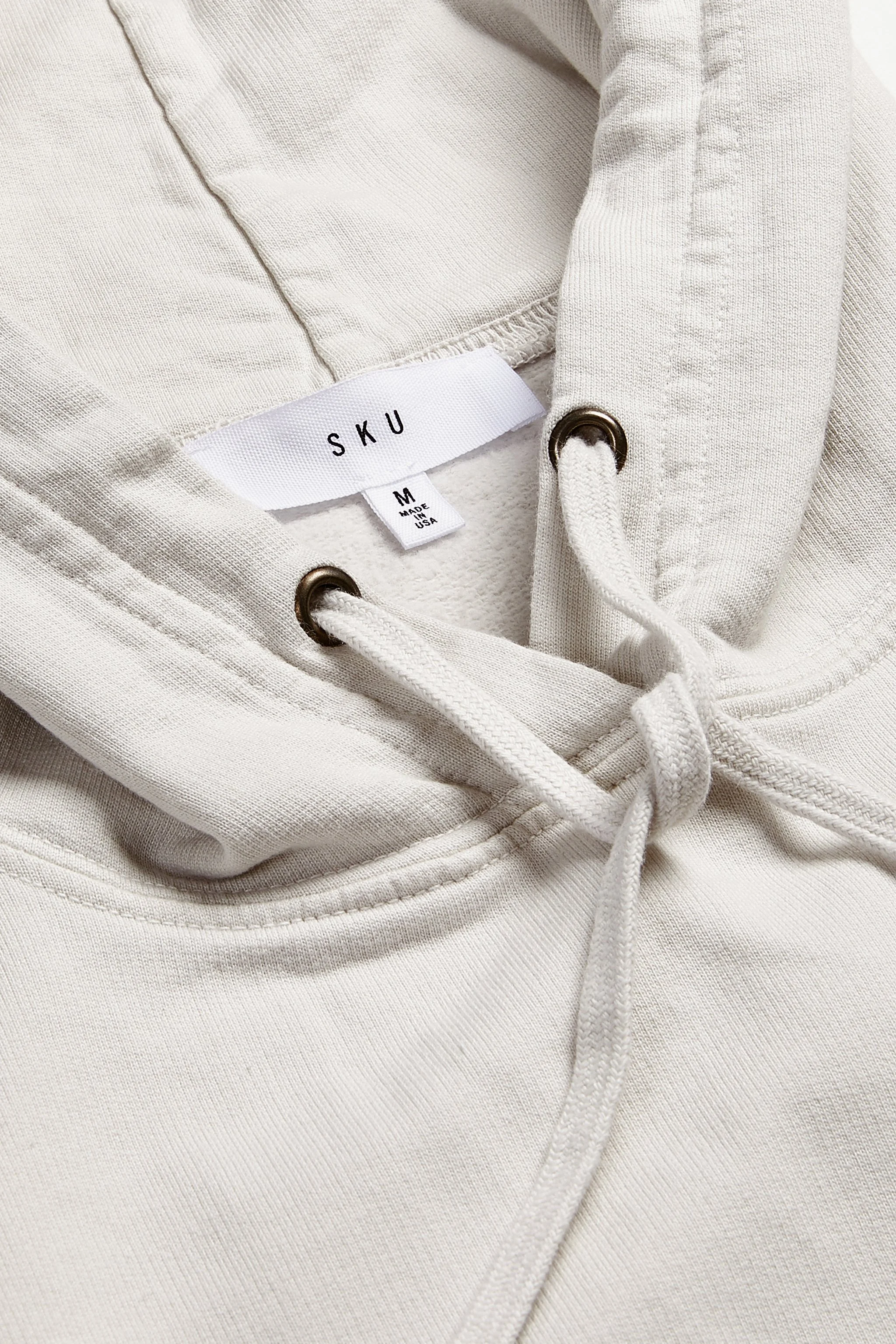
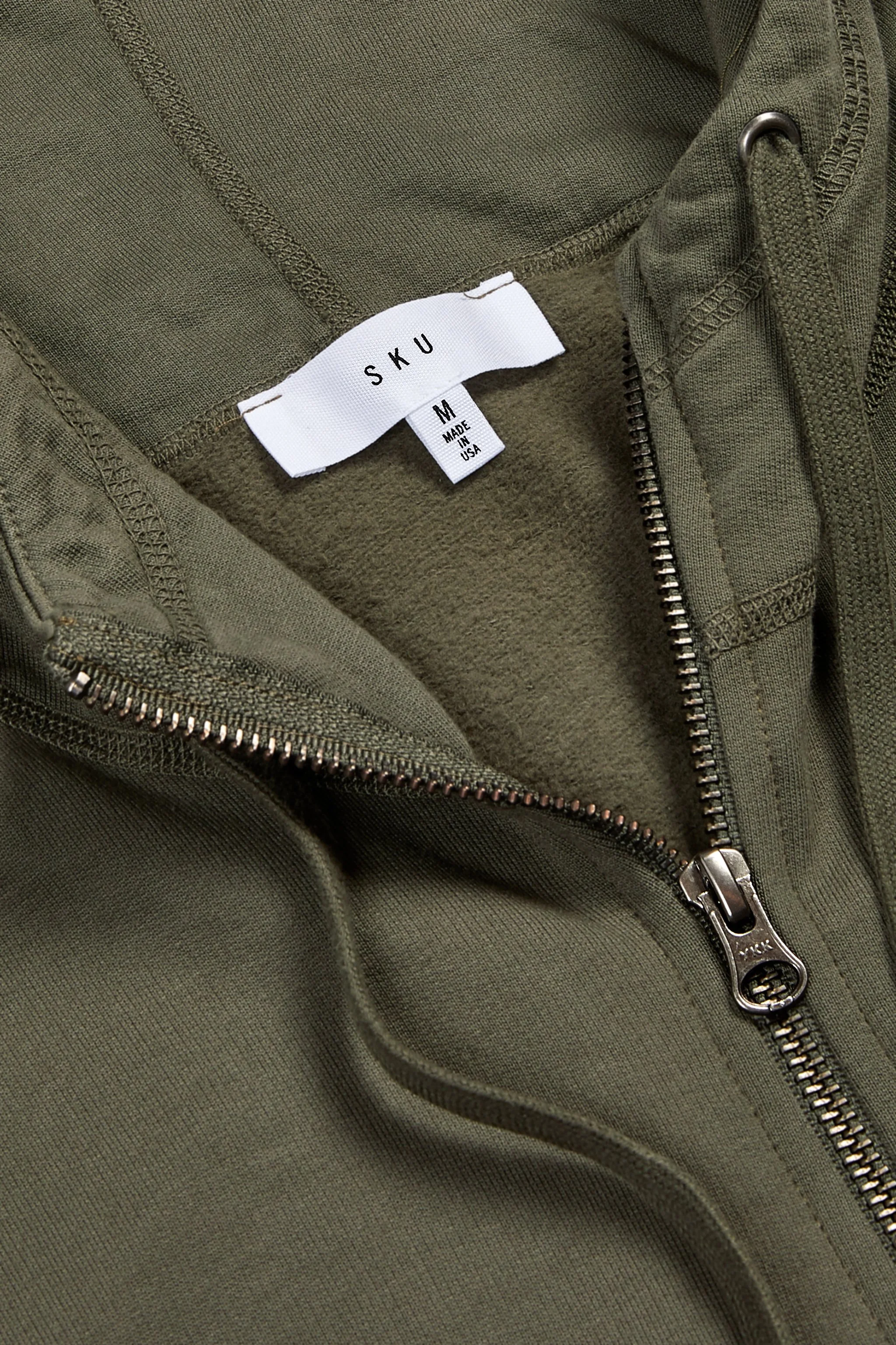
Retouching Quality: The Invisible Skill
Great retouching is invisible—you shouldn't notice it. Bad retouching screams amateur. Here’s what to look for.
Looks natural, not over-processed:
Products should look real, not plastic or artificial. Skin (on model shots) should have texture, not airbrushed into oblivion.
Background work is clean:
White backgrounds should be pure white with no weird halos or rough cutouts around products. If you see:
- Gray fringing around edges
- Choppy, jagged cutouts
- Visible masking errors
- Products floating awkwardly above backgrounds
That's poor retouching technique.
Dust and imperfections removed:
Small dust specks, tiny scratches, or minor imperfections should be cleaned up without making products look fake.
Colors remain accurate:
Heavy retouching often destroys color relationships. If beauty products all start looking similar or apparel colors look unnaturally vibrant, that's over-editing.
Red flags:
- Over-processed, plastic-looking products
- Obvious editing mistakes around edges
- Unrealistic colors or contrast
- Visible halos or artifacts
The Questions to Ask After Reviewing Their Portfolio
Once you've reviewed the portfolio and like what you see, ask:
"Can I see a complete project from start to finish?"
Request to see all images from one specific project—not just the portfolio highlights. This shows consistency and reveals what they consider finished deliverables.
"How do you maintain consistency across large catalogs?"
Their answer should include specific processes, equipment, and workflows. If they just say "we're careful," that's not reassuring.
"Can I see examples of products similar to mine?"
Even if their portfolio is impressive, request specific relevant examples. You want to see proof they've handled products exactly like yours.
"Who are your typical clients and what categories do you specialize in?"
Listen for specificity. "We shoot everything" is less convincing than "We specialize in fashion apparel, accessories, and beauty products for eCommerce brands."
"What's your retouching process and turnaround?"
Professional studios should have clear retouching standards and realistic timelines. If turnaround sounds impossibly fast, quality might suffer.
The Ultimate Portfolio Test
Here's our favorite evaluation method: imagine your products in their portfolio.
Look at their work and honestly ask: "Would my products fit naturally into this portfolio? Would they look as good as what I'm seeing here? Does this quality level match what I need?"
If you're a luxury accessories brand and the portfolio shows mostly budget products, there's a mismatch. If you need high-volume catalog work and the portfolio shows only boutique, low-quantity shoots, they might not scale. The portfolio should make you confident that your products will look equally impressive. If there's doubt, keep looking.
Why Our Portfolio Shows What It Shows
We're deliberate about what we feature in our case studies and portfolio.
We show complete projects: Not just the one perfect hero shot, but representative coverage showing consistency.
We feature diverse categories: Apparel, accessories, beauty, and general products all represented.
We include recognizable brands: Dover Street Market, White & Warren, and others—proving we can meet professional standards.
We show volume capability: Collections of 50, 100, 300+ pieces demonstrating we maintain quality at scale.
We display recent work: Everything in our portfolio is from the last 1-2 years, showing current capabilities.
That's what a professional portfolio should look like—comprehensive proof of capabilities, not just cherry-picked highlights.
The Bottom Line: Trust Your Eyes (And Your Gut)
Reviewing photography portfolios isn't about technical expertise—it's about knowing what to look for. With these guidelines, you can evaluate portfolios like a pro even if you're not a photographer yourself.
The right studio's portfolio should make you think: "Yes, that's exactly the quality I need. My products would look incredible shot like this." If you're not getting that feeling, keep searching.
Ready to see what professional product photography looks like for brands like yours? Browse our case studies or schedule a conversation about your specific needs. Because after seven years and tens of thousands of products photographed, our portfolio speaks for itself.